
Understanding The Problem
A Need for more caregivers
With more than 7.2M adults requiring personal assistance as they begin to age, due to physical, behavioral, developmental or chronic health issues, a need for home health care-taking is on the rise now more than ever.
There is an increase for the need of personal care, with life expectancy increasing, ever-growing populations and shifts in societal contributing factors such as, marriage patterns, work force participation and care-giving from family members.
By 2024, the need for assistance in care-giving will be up by 20%, making it one of the fastest growing industries on the market.

The Challenge
To create the right tools, resources and support for people to aid in the process of taking on the role of an at-home caregiver for a loved one
The Process

An iterative user-centered design process comprised of the following phases:
Discovery, Empathize, Ideate, Design and Test
The Outcome
A design that allows the user to easily accomplish tasks in order to care for their loved one with the support of a care team, reminders and access to an expert, all in one easy to use application
Skills: Competitive Analysis, User Stories, User Interviews, Affinity Mapping, User Personas, User Flows, Card Sorting, Prototyping, Usability Testing, Preference Testing, Systems of Design
Duration: January 2022 – August 2022
Role: UX Designer
Discovery
Purpose: To better understand the problem space, competitors and gain user perceptive in order to identify how business requirements and user goals align
Forming A hypothesis
Discover, define and develop the question of “what problem you are trying to solve?”

Possible Problems
It’s hard to find help when it comes to information on elderly care especially all in one place
When it comes time that a person needs help finding solutions around taking care of loved ones, they could be going through a lot of emotional overwhelm already
Finding real, quick, and easy information to help care for elderly loved ones is a space that needs improvement

Defining the Problem
How might we help people find information for their elderly loved ones?
People need a way to find information on caring for their aging loved ones because becoming a caregiver can be hard to navigate alone.
We will know this to be true when we see people getting easy, quick and reliable help and information on how best to care for their elderly loved one.
Potential Solutions
Create a safe space where people can come for fast and easy advice on how to help manage and find help caring for their loved ones
Allow users to talk to experts in the healthcare industry that can help them navigate the space and find best practices to help their loved ones
Allow users to feel like they are not alone in the process of navigating this new care-taking task
Understand the market
Starting with a quantitative approach, learning more about how many people need care now and a look into the future of at-home care. As I learned of the growing number of aging persons that will need help aging in place, and all the factors that are contributing to this increase in numbers, I wanted to dig further into what may already exist to help combat this growing issue.
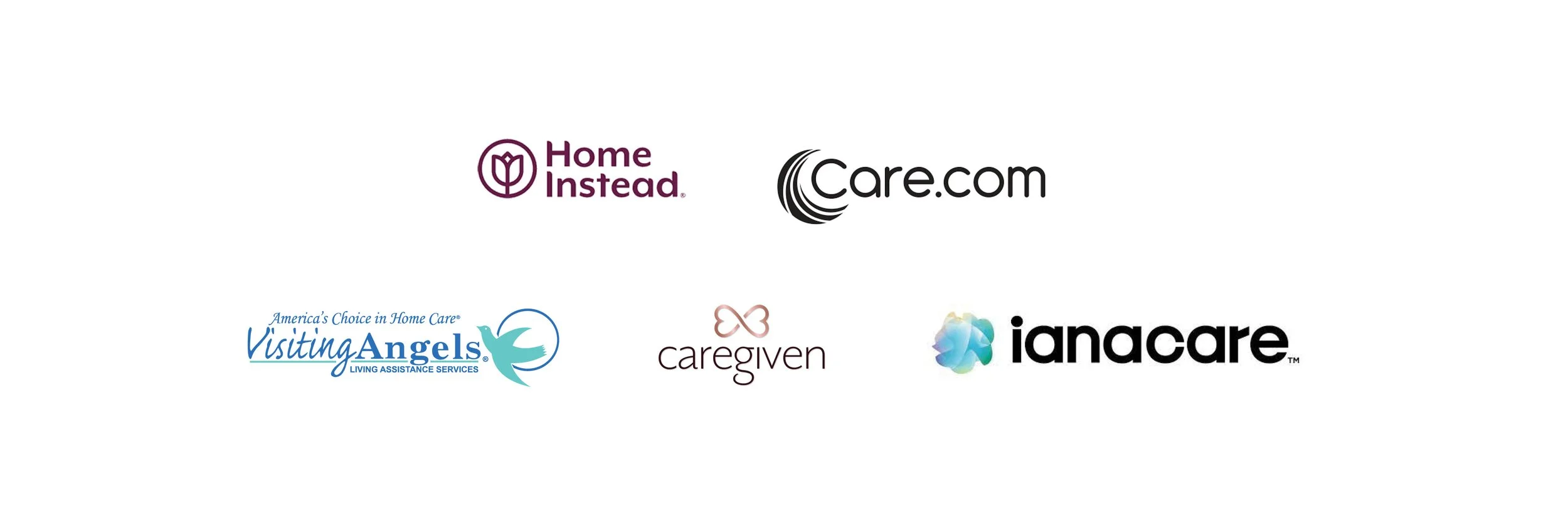
To better understand the problem space of at home elder care, I began to look at competitors to gain a better sense of what may already exist in this particular space and what may be lacking.
Competitive Analysis
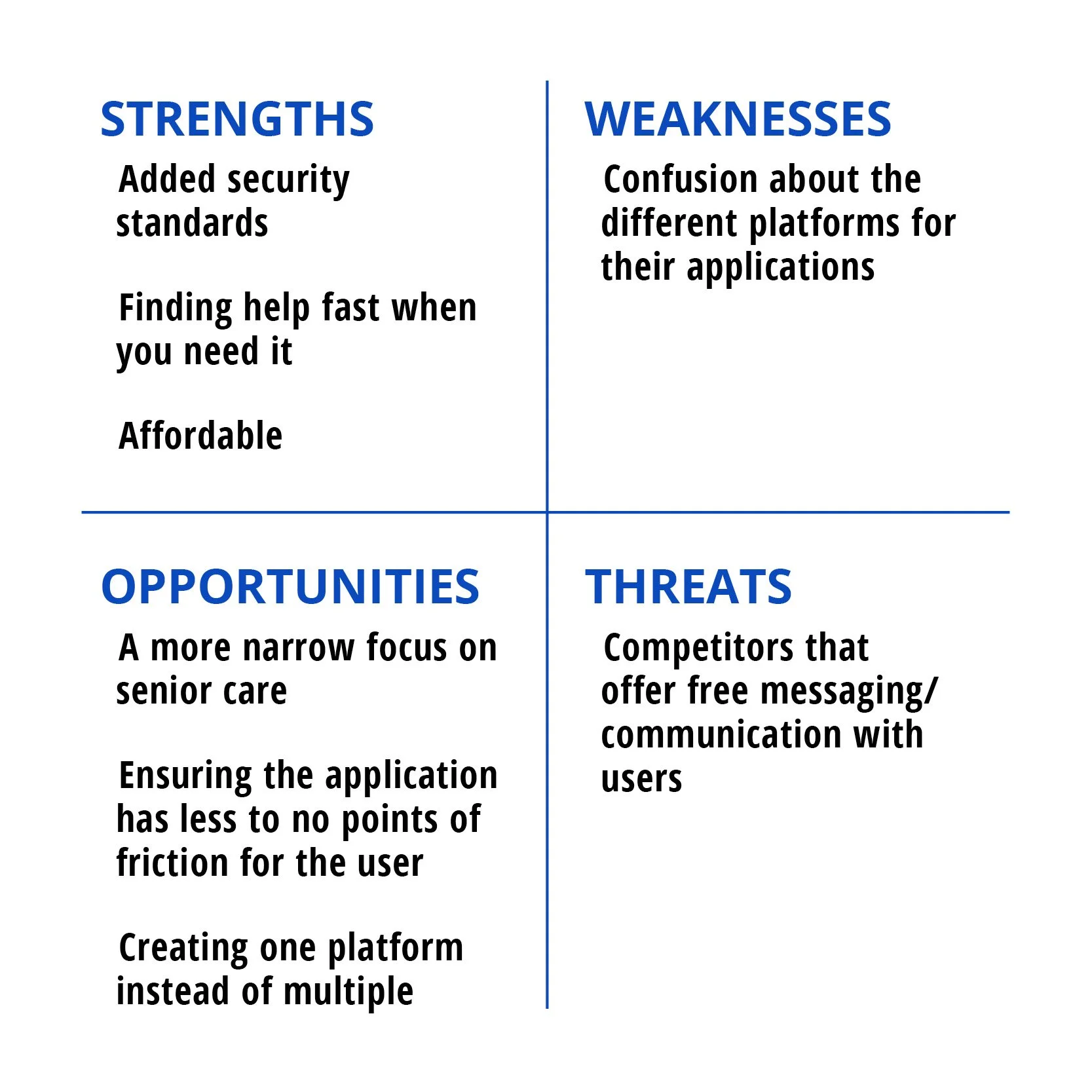
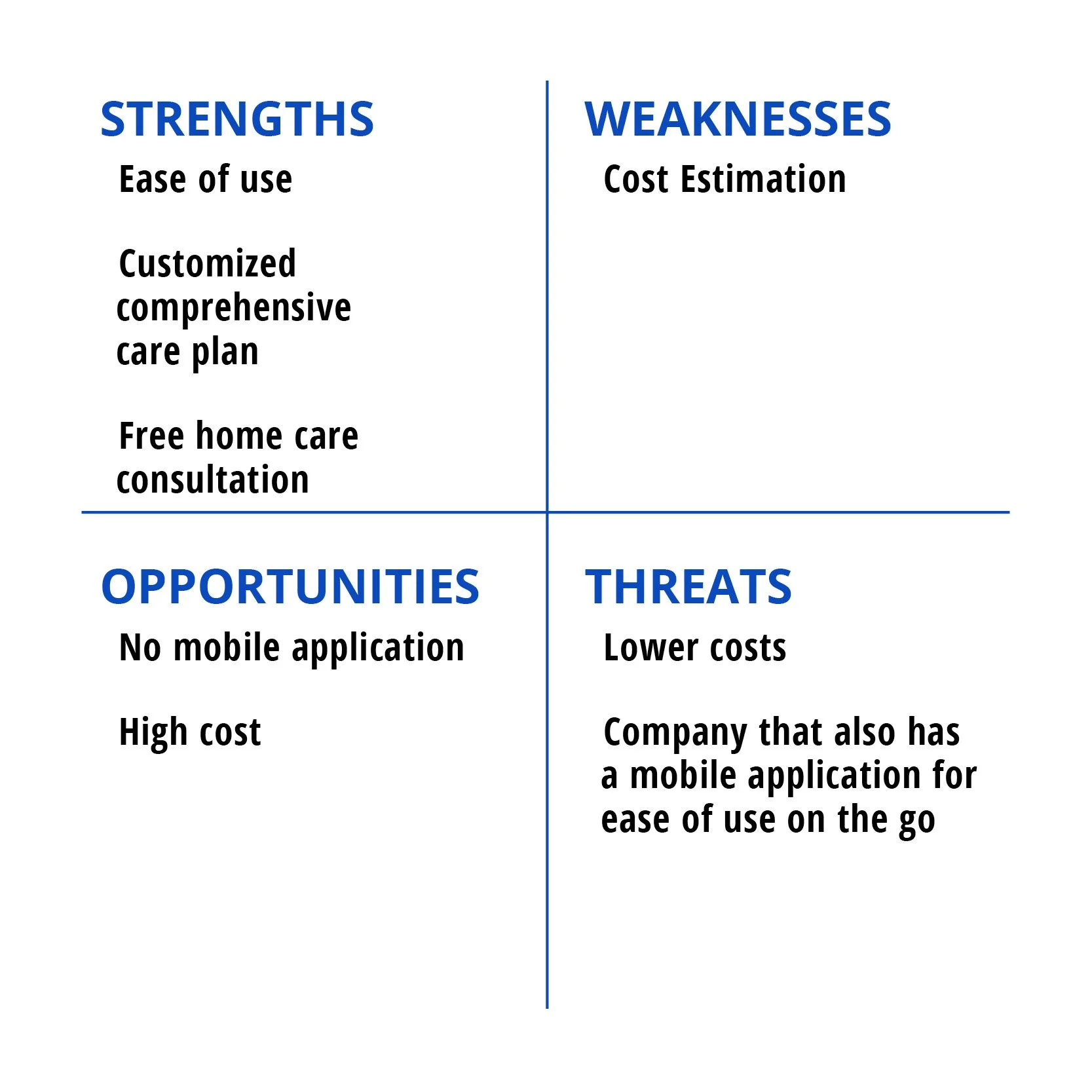
A competitive analysis can help identify what strengths and weaknesses competitors may have as well as look at the opportunities for improvement and anything that may pose a potential threat. I looked at competitors like Care.com, Visiting Angels, ianacare and caregiven to understand what was working and not working on their platforms. It also gave me key insight into the types of care people are looking for

Care.com
Care.com offers employment to those seeking the ability to offer their care-giving skills and also offers the ability for people to help get care for their loved ones.
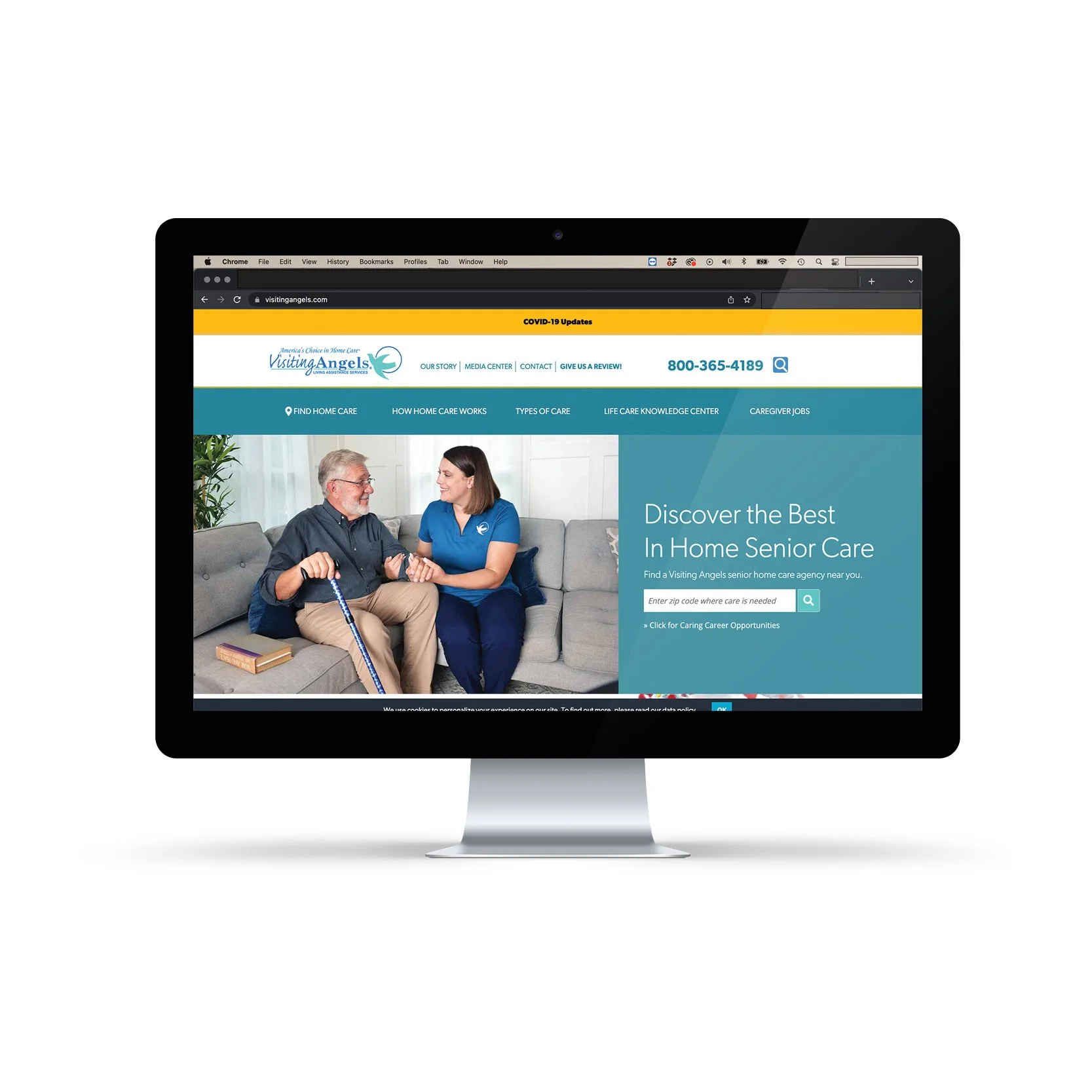
Visiting Angels
Visiting Angels, an in-home care service for seniors offers a variety of care options from personal care, end of life care, overnight care, and respite care.
Market Insights Identified

By analyzing competitors I was able to identify key components that they all seemed to share and to re-sort those into 5 main categories of care: personal care, memory care, overnight care, serious illness care, and end of life care.
I also discovered that a huge issue with this industry is of course going to be around the safety of the patient that requires care. Care.com for example offers background checks, social security number traces, national sex offenders public search, multi-jurisdictional criminal database search, motor vehicle records and more.

Another discovery was that apps like caregiven and ianacare focus on care for the caregiver because if the caregiver doesn’t take care of their own health, they wont be able to care for another person. Both of these apps also focus on having a care team, so the caregiver doesn’t get burned out because caring for someone can be emotionally and mentally draining.
understand the business
To ensure that user needs align with the needs and goals of the business, I created a Business Requirements Document to help accomplish this. I looked at the goals of the business, targeting to define the objectives specifically, the scope of product specifications, functional requirements and created a delivery schedule to ensure deadlines were spelled out
Target Audience
The target audience for this app is 40–50 year olds; around the age that adult children may need to start caring for their aging parents.
Competition
Some competitors are Visiting Angels and Care.com as both are geared towards helping care for an elderly loved one and provided a variety of care services. They both make it easy to find the type of care you would need for an aging loved one all in one place.
Risk
The primary risk is that an established brand with national commercials such as Care.com or Visiting Angels may have a better reputation or be more trusted in the care industry with already established security measures like background checks.
The Opportunity
Our app can facilitate an immediate response by going into our responsive mobile app and speaking directly with an expert, any time – day or night.
Conclusions
We seek to offer a way for people to find care , information, and reduced the stress and hassle associated with caring for aging loved ones, all in one space that makes it convenient and simplified to the user.
Identify the Problem
By identifying questions, goals and the current market I was able to create a problem statement
Problem Statement
How might we help people find information for their elderly loved ones?
Define Research Goals
To ensure the project remains on track and the information gathered is relevant and kept in focus, I identified 5 main goals before conducting user research
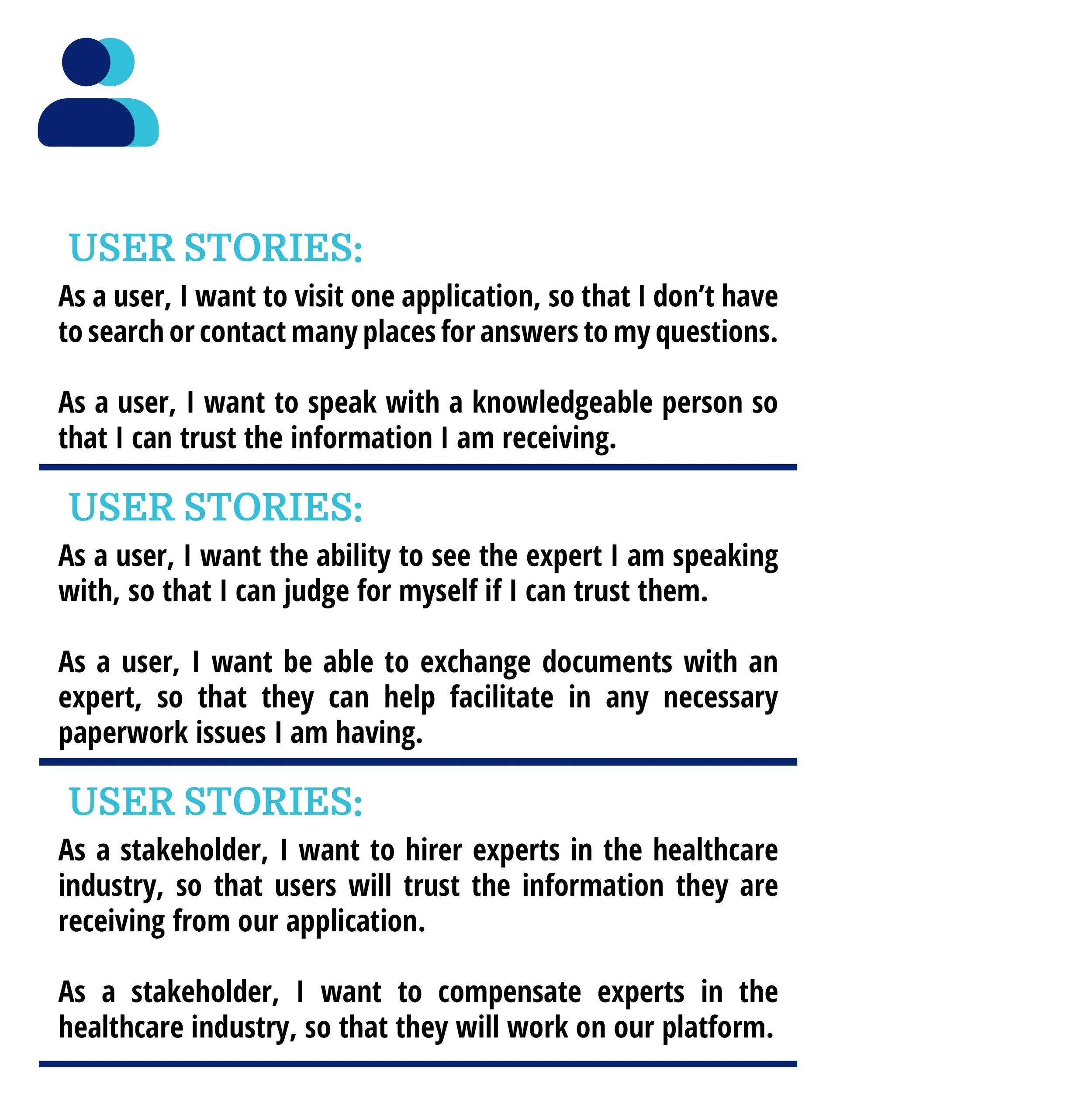
Understand the user
Developing User Stories can help bring action to life within our application and humanize the needs of our users


User Interviews
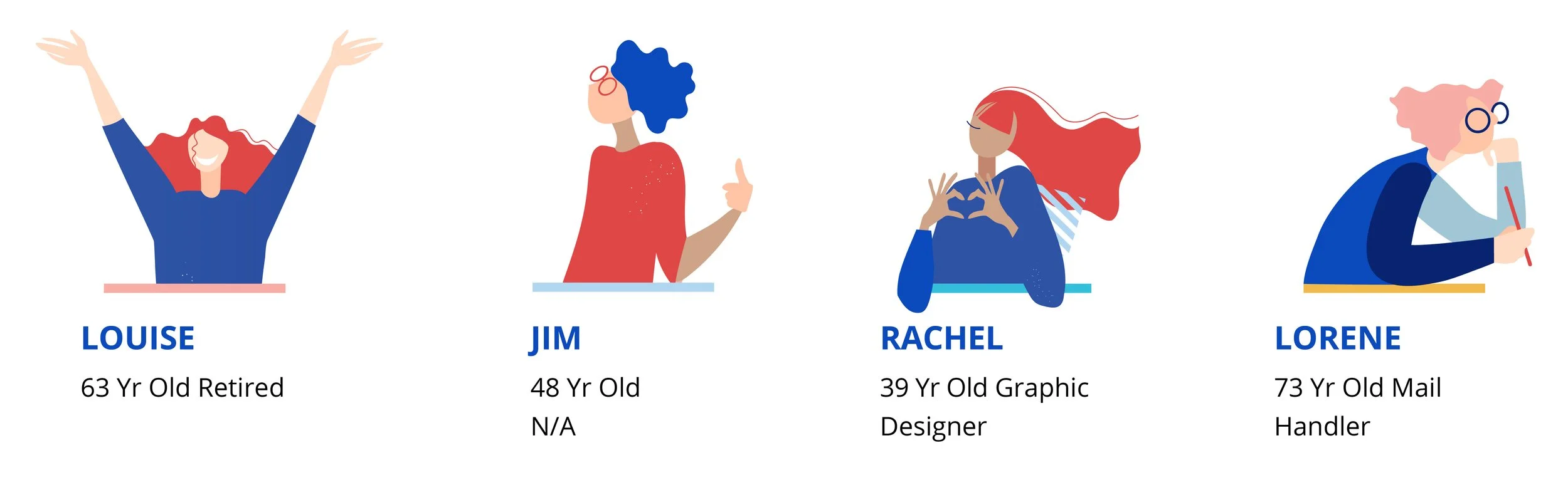
In order to gain valuable insight into what potential user’s needs and behaviors are I first compiled a user survey to help identify that my questions were in-line with users, then I created interview questions and conducted 4 user interviews, identifying users that have previously taken care of a loved one that could no long care for themself in some capacity
I knew these interviews were going to uncover the most useful and insightful information for this project because it would be in these stories that I would learn about what types of care their loved ones needed help with, where people started their search for help, understand the behavior and emotions felt during the time of care and really learn about any barriers the users went through during the whole process
Affinity Mapping
To organize and sort the data collected from user interviews I created group clusters with keywords or themes to really start to understand how multiple participants were experiencing similar pain points, positive experiences or needs
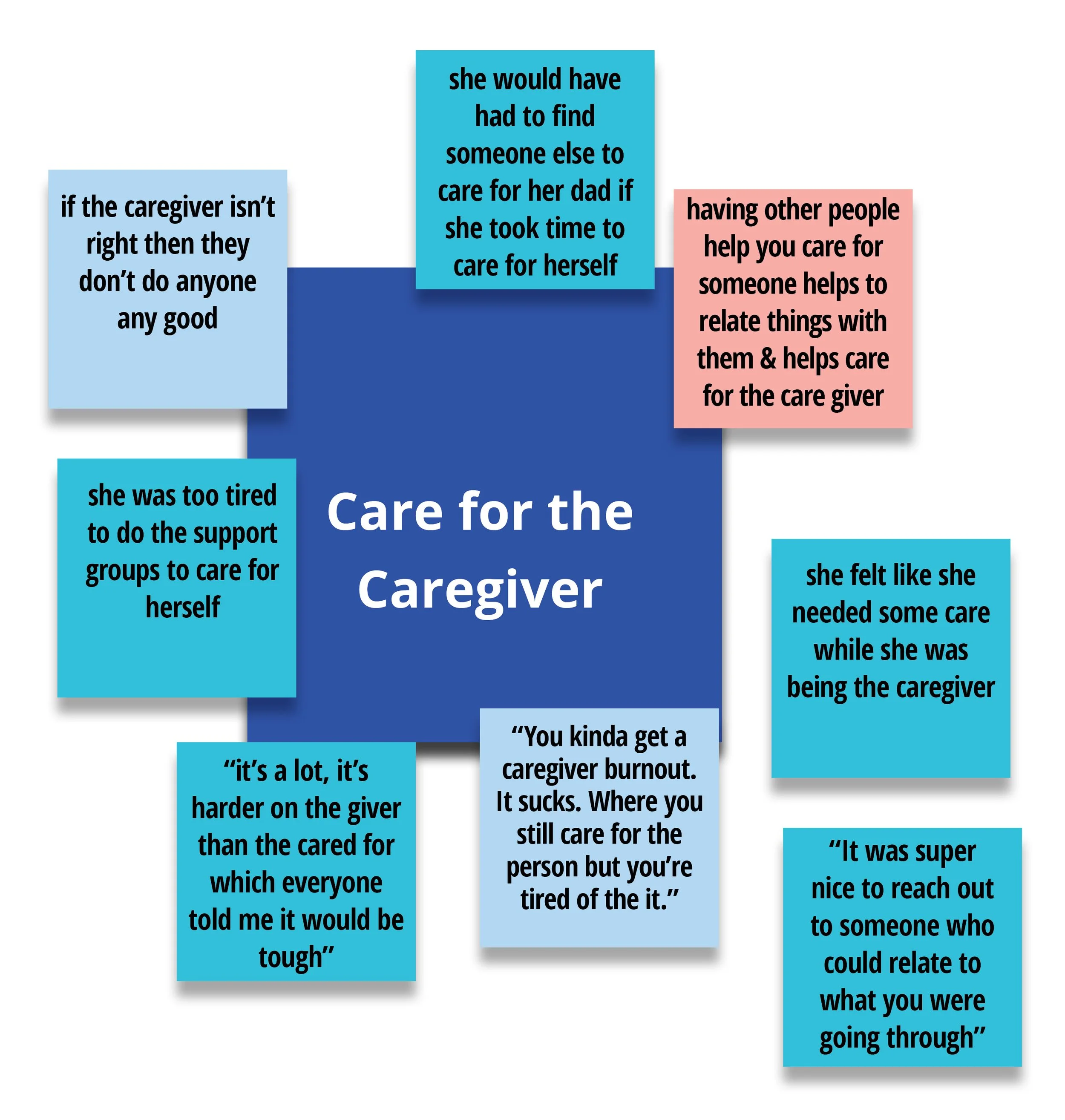
Insights:
From looking at the Care for the Caregiver affinity mapping cluster I understood that having care for the caregiver is absolutely necessary
If the caregiver isn’t taken care of emotionally and physically they aren’t going to be very good help for the patient
People put off caring for themselves in order to care for the patient
Having someone who can relate to becoming a caretaker helps to alleviate some emotional stress
User Needs:
Care for themselves
A way to recharge
Help to care for their loved one when they are recharging
Help identifying when they should be caring for themselves
Help finding ways to care for themselves
Empathize
To humanize this data, I created personas to begin to dissect user needs, behaviors, thoughts, emotions and really identify opportunities to meet the needs of the user
Represent the user
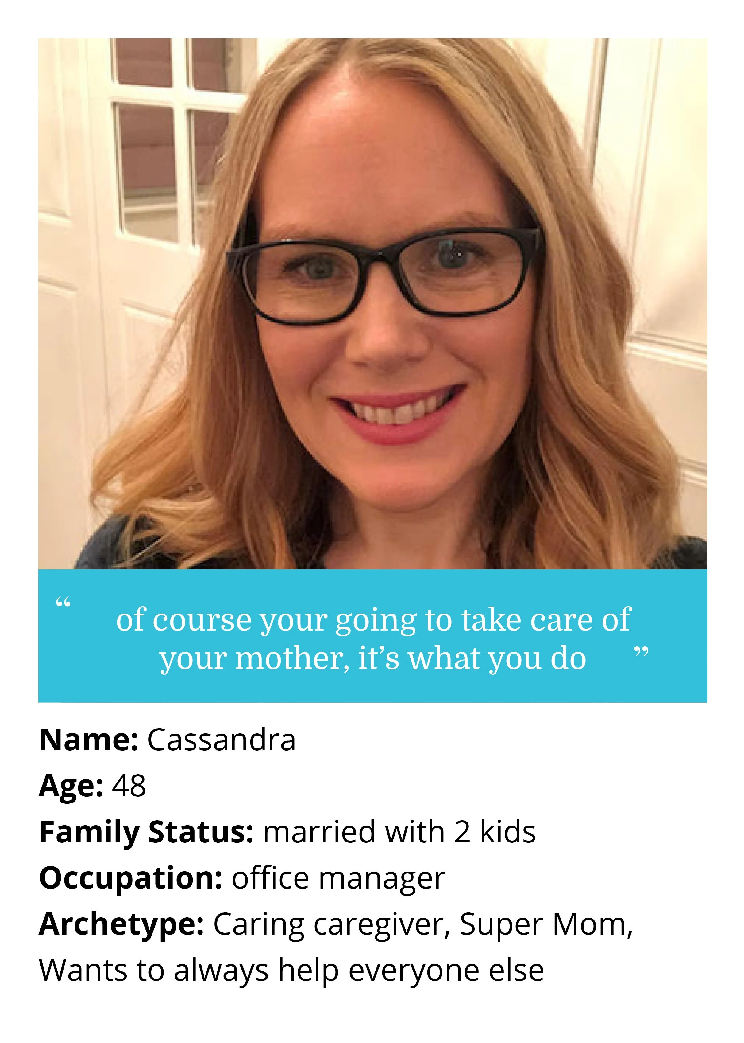
Persona 1
Cassandra is a caring caregiver, super Mom, who wants to always help everyone else. Her mother has experienced a stroke and now needs extra care. Cassandra has help from her family to take care of her mother and her mother has her own private health care insurance. Cassandra and her siblings feel like their mother took care of them so they should take care of their mother now when she needs it.
Cassandra – Journey Map

Persona 2
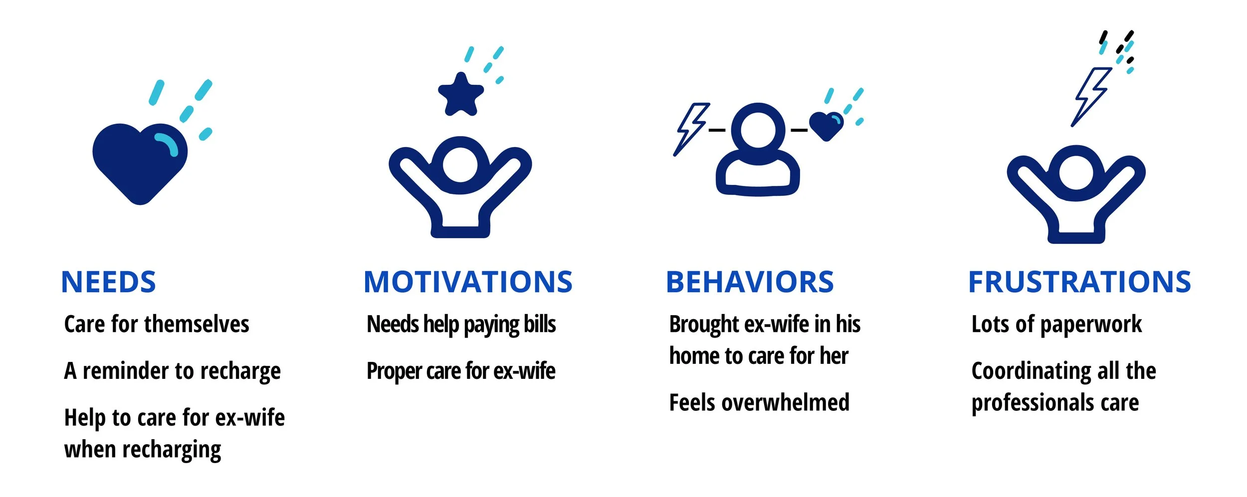
Jonathan on the other hand is used to being a loner and has never really taken care of anyone else but himself. He has agreed to take care of his ex-wife who doesn’t have anyone else to care for her and who can potentially help him out financially as she currently collects a disability check every month. His ex-wife doesn’t have her own insurance and so she falls back on government assistance thru medicare and medicaid. Jonathan doesn’t have any family to help care for his ex-wife with him, so he relies on professional help frequently.

Jonathan – Journey Map
Understanding the Persona
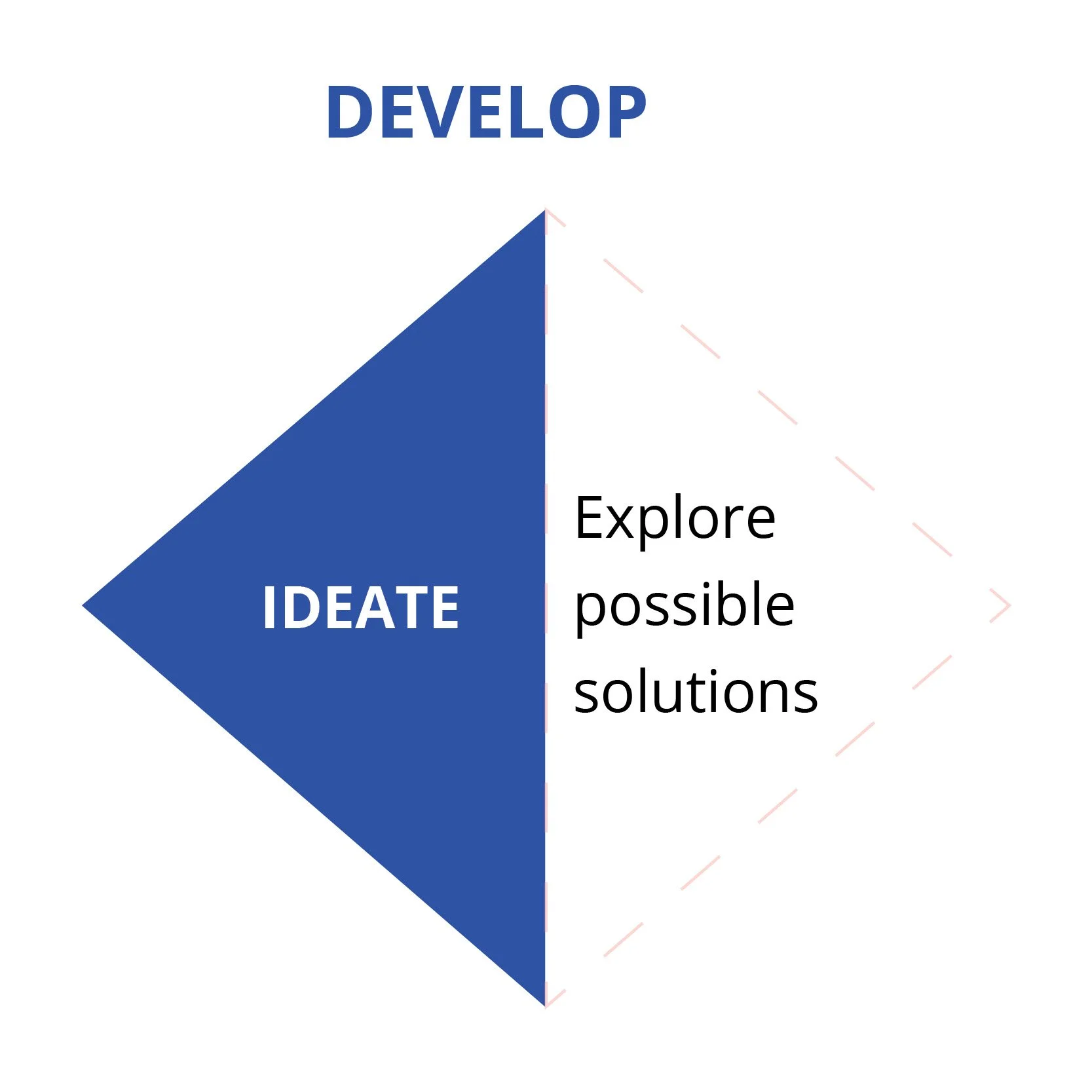
Ideate
Purpose: ideating design solutions that address the user and business requirements
Enhance the Usability
User Flows
After we have gathered some key information we can produce an objective for our persona and then build out a user flow diagram to identify the simplest path for our persona to navigate to the tool that she needs to fulfill her goals. For this example we see that from the main menu, Cassandra will simply create a new care team so that she can add her siblings as contacts through the application. She can then use the task calendar to either offer help or request help from her care team for tasks that need to be accomplished.
The success criteria is that all the siblings know what tasks they are doing to help be a part of the at home care team and on what days.
Objective for persona
As a [daughter who has a mother that needs in home care], I want [to be able to create a care team between myself and my siblings], so that [we can take care of our mother in the best and most efficient way possible].
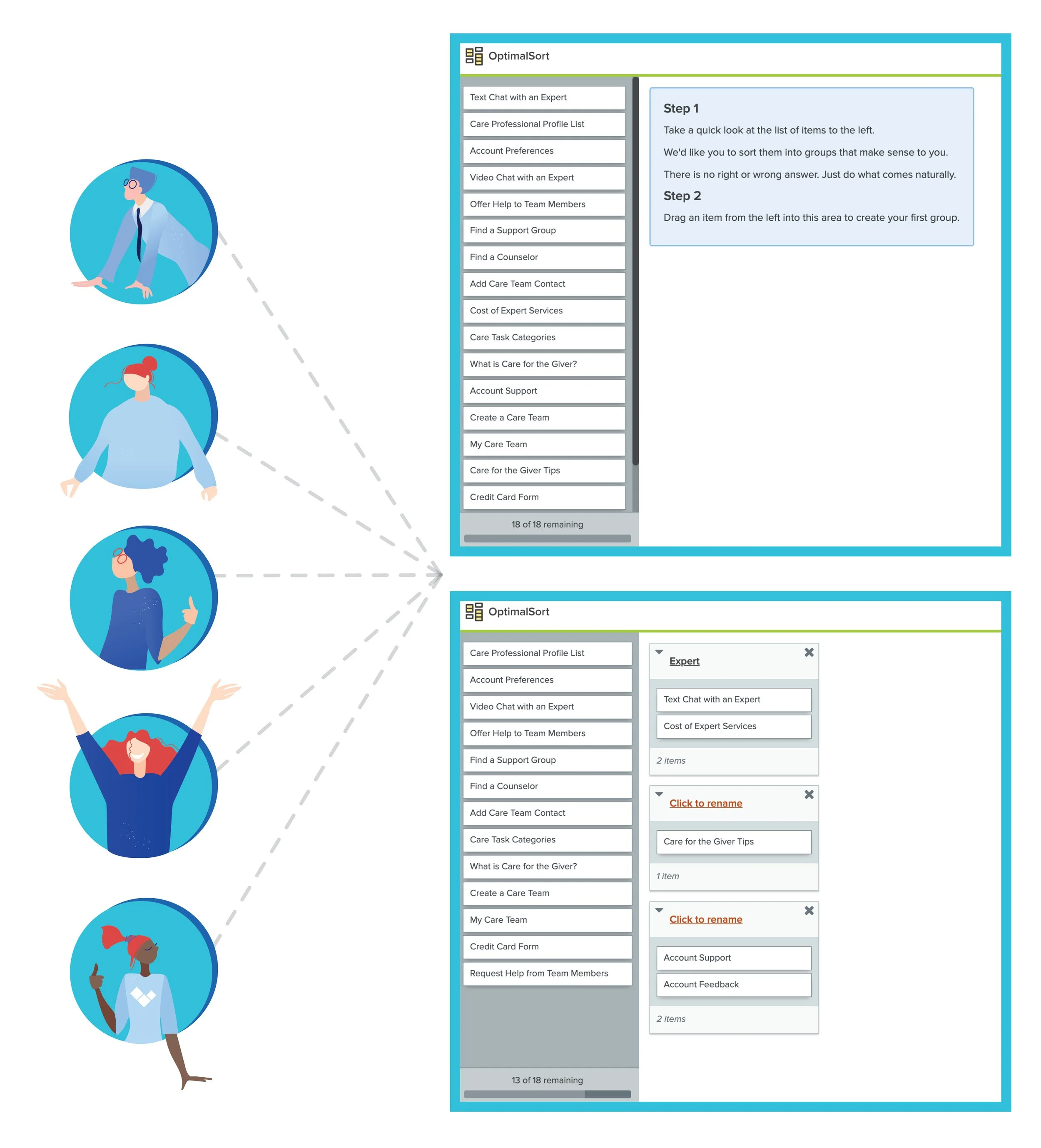
Card Sorting
This is a great tool to help identify information architecture but you also have to use your own digression and you can refine further later if needed
Discoveries
Participants are sorting the credit card form under Account Preferences 100% of the time which is a different sort than I was previously categorizing so I will need to add credit card information under the My Account tab.
Participants created a search category that I think would be a great addition I didn’t previously realize.
80% of the time participants categorized care task categories with create a care team so I think it would make sense to add the task calendar under the care team page so that also on the off chance someone is caring for more than one person they can locate the task calendar associated with the care team for that individual loved one.
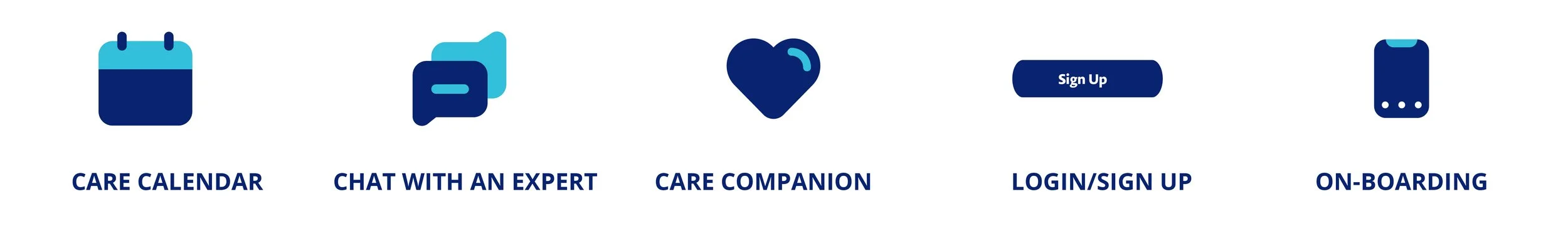
Site Map
The other 5 core features will be the ability to Chat with an Expert in case user’s need some questions answered throughout the care-giving process.
A Care Team feature to allow users to create a group of individual’s to assisting in the caring process because as I learned through primary research most people feel overwhelmed and can get burned out quickly if they don’t have help and resources.
A Care Calendar to keep track of who is helping on which days and at what time and to get notifications when the user’s loved one needs assistance.
A Care Companion feature allows users the ability to hire professional caregivers because another discover I had during primary research was that some people don’t have others to help them, but they are still in need of someone to help take the burden off.
And finally, the Care for the Giver feature which will have resources for the caregiver to help ensure they are supported and cared for as well.
Design
Purpose: identify design solutions to meet the user and business goals
IDENTIFY POTENTIAL SOLUTIONS
Low Fidelity Prototypes
Low-fidelity paper sketching is a great way to lay the basic foundation and not get too caught up in the details too early in the process – slow down and simplify. I could start with just the basic elements needed for the features I wanted to incorporate, keeping the application simplified and allowing for discovery if I left anything out or needed to move some elements around.
After identifying the elements for all my features on mobile first, I moved on to the low-fidelity prototypes for the desktop, as you can see in this example for the care calendar task - it allowed me to think about the extra real estate I would have on a larger screen size and what I may do with that.
Care Calendar Mobile
Care Calendar Desktop
Mid-Fidelity Prototypes
Moving from low-fidelity paper sketching into a clickable prototype can reveal flow issues or identify more needs or opportunities for the user
Care Companion Mobile
Testing
Purpose: testing design solutions to verify if they effectively meet the user and business goals
Improve Usability
Usability Test Plan
To help identify further issues, testing the usability of this clickable prototype with participants early on will save time and resources later down the road

Background + Methodology
Background
I conducted a moderated usability test for the responsive mobile application HelpWell.
Primary Persona:
Someone that has taken over the care of a loved one who can no longer care for themselves in some capacity.
Testing:
Errors
Methodology
Moderated remote sessions using LoopBack and Zoom
Goals + Objectives
It is important that we set testing goals and objectives so we can identify if our product is meeting those achievements
Goals
Test 3 main tasks: Care Calendar, Chat with an Expert and Care Companion.
As well as Login/Sign up and On-boarding screens
Test Objectives
Sign Up / Login Screen: Identifying if this sign up and login screen is free from error
On-boarding: Identifying if this helps familiarize the user with the features of the application
Observe how participants navigate through the application to ensure ease of use & ability to find the tools they need
Care Calendar: Adding a task to the care calendar either through the form
Chat with an Expert: Identifying & choose a method for finding an answer to a question when needed
Care Companion: Ensuring participants can easily find a professional profiles & navigate through the process of messaging one of them from start to finish
Participants
I conducted usability testing with 6 participants. I gathered basic demographic information on each participant and discovered that most knew how to use mobile devices and common universal design patterns with the exception of one participant.
This one participant could help me understand how someone with limited knowledge of universal mobile design patterns interacts with the app as well and inform me of how to make the app more user friendly for everyone.

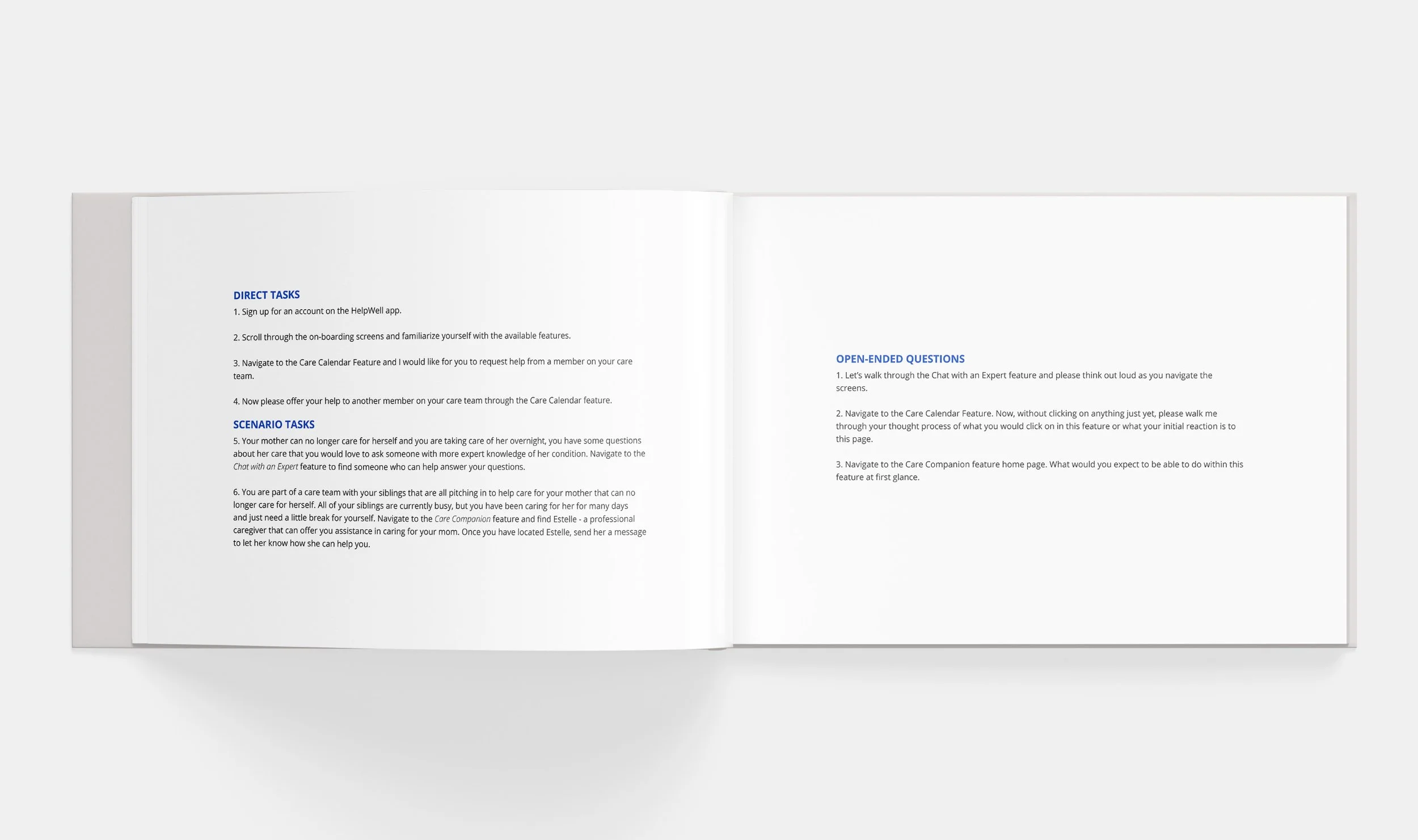
Creating a Test Script
Having direct tasks, scenario tasks and open ended questions for test participants to complete helps ensure work-arounds incase participants get confused about how a task is directed.
After introducing myself and walking the participant through expectations and the basic process, I asked the participant a few basic demographic questions and some background questions pertaining to the amount of time they spend on-line, what types of apps they use and if they were currently or had ever taken care of a loved one.
Next I asked them to complete the direct tasks like, sign up for an account, Scroll through the on-boarding screens to familiarize yourself with the features, and to request help and also offer their help through the Care Calendar Task.
When one of the participants got confused or a little lost in my direct task question, I could easily use a scenario task to help them better understand what I was wanting them to accomplish.
Once I had finished running through the direct and scenario tasks with my participants, I asked them to go through some open ended questions. I wanted to gain a better idea of the participant’s impressions of the screen for my three main tasks, the Chat with an Expert, Care Calendar and Care Companion tasks.
Some Key Insight I gained was that participants were more likely to open up and walk me through their thought process or initial reactions to the screen if I didn’t ask them to complete a task at the same time such as I did when walking them through the direct and scenario tasks. Just having them land on a page and asking them to tell me what they think about how it looks or what they thought its purpose was without any other direction allowed them to focus solely on that.
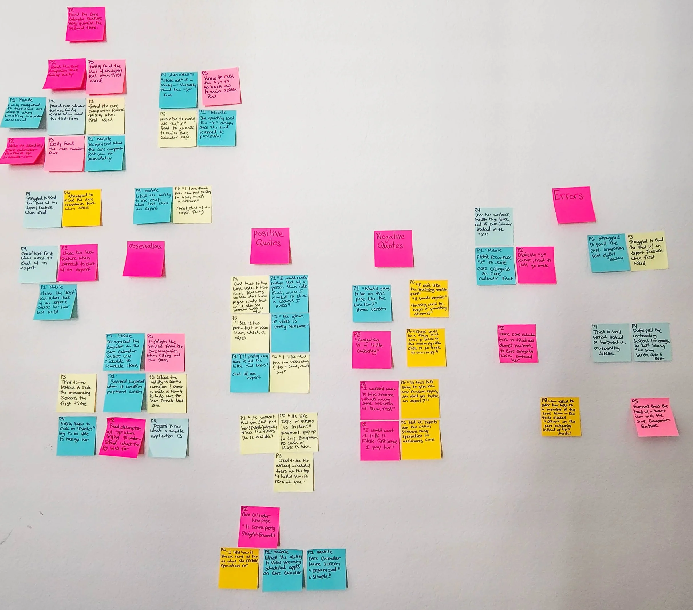
Affinity Mapping
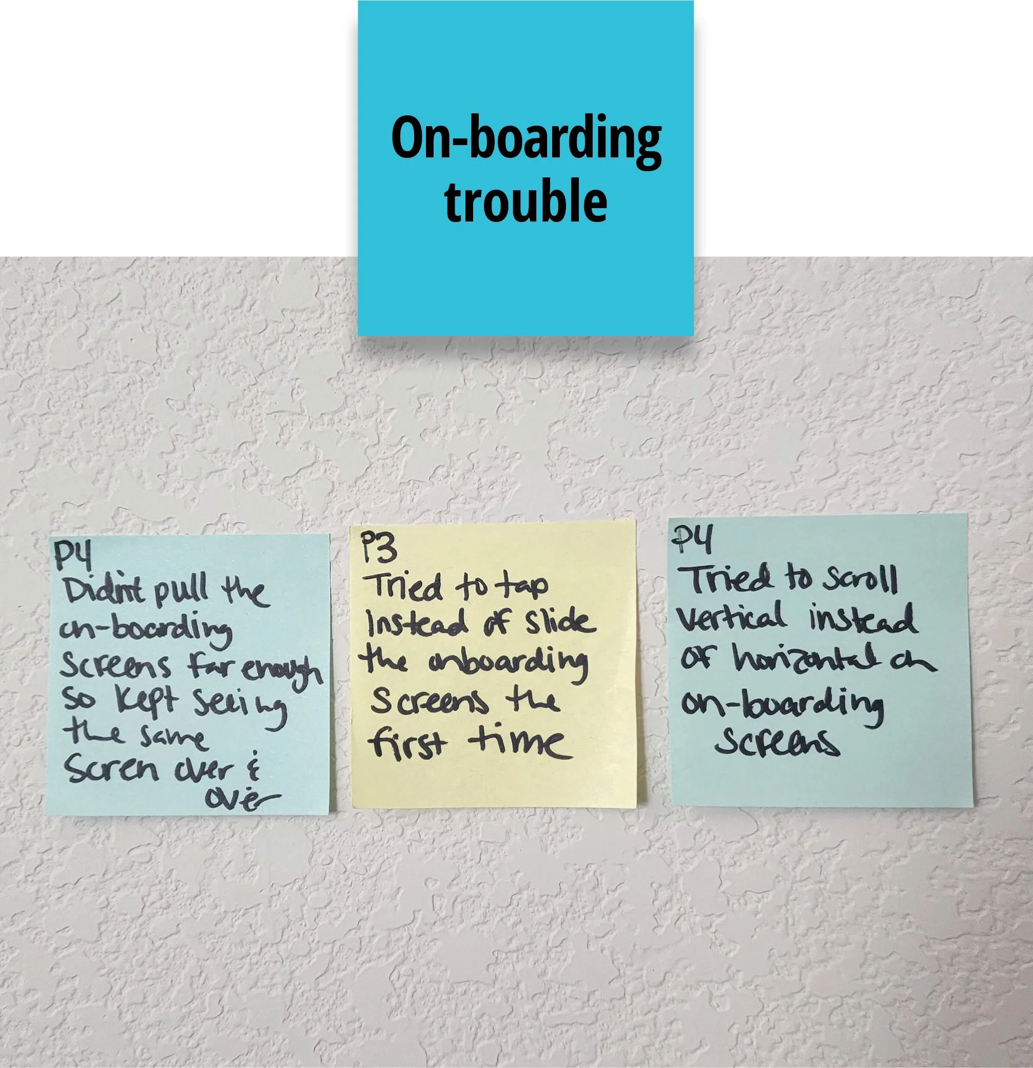
Through creating affinity mapping I was able to clusters similar data and gain insight into common problems participants were having. I identified some key navigation issues as well as some on-boarding screen trouble.
For the navigation issues, I had every participant at one point or another struggle to find what I was asking them to find and I even had one participant state, “ the Navigation is a little confusing.”
For the on-boarding screens, I was able to observe that one participant tried to tap instead of slide the screens and another tried to scroll vertically instead of horizontally as well as, when she did eventually slide the screens, she didn’t quite get them to slide far enough and she kept seeing the same screen repeating over and over again.
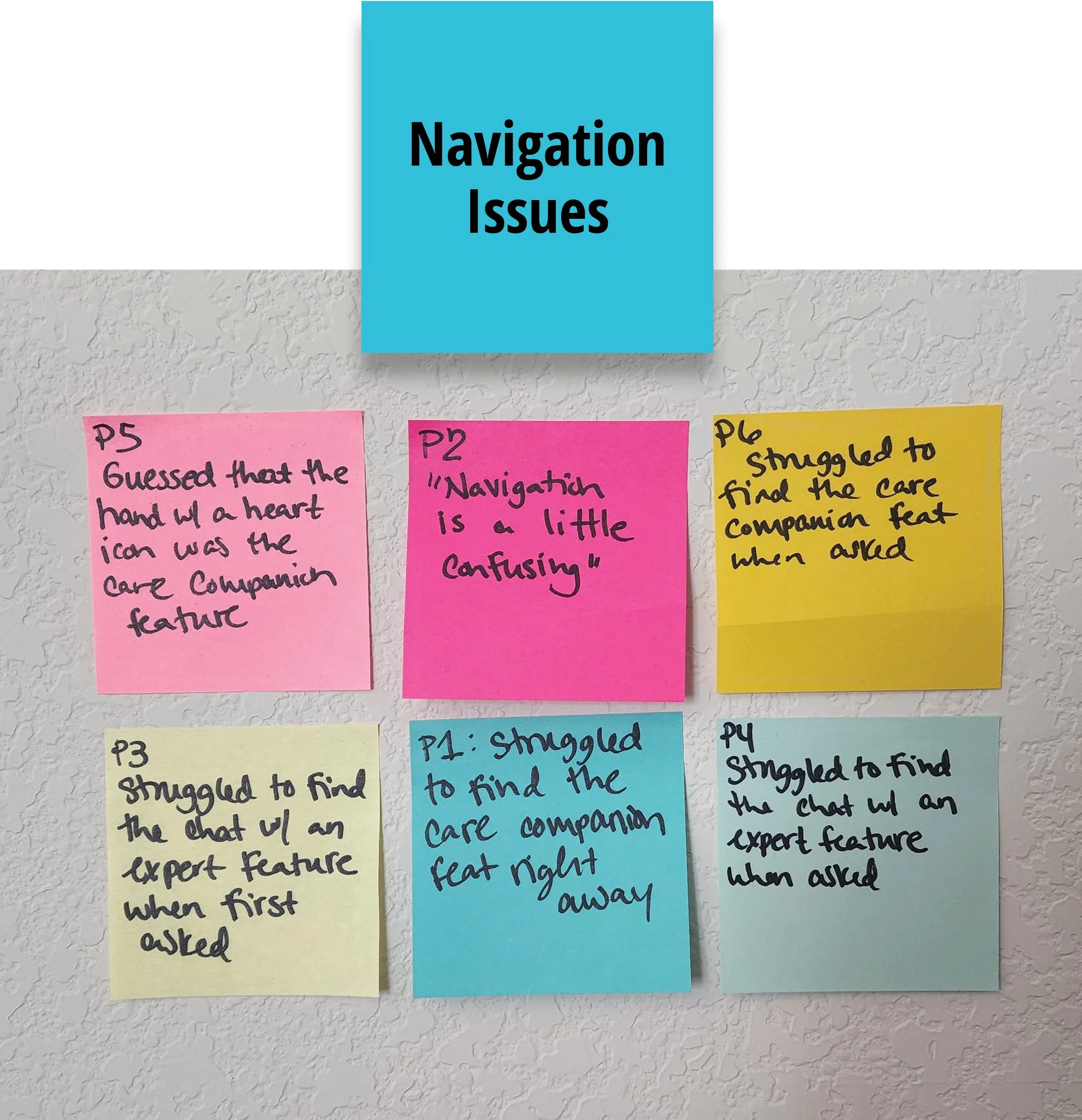
Key Insights:
Issues with main navigation
Recommendation:
Add title text to main bottom navigation for better clarity; use coach marks in addition to on-boarding screens to better introduce tasks
On-boarding screen trouble
Recommendation:
Make the on-boarding screens clickable as well as slidable
Rainbow Spreadsheet
Another great method for evaluating all the data from the usability tests is to sort the information into a rainbow spreadsheet allowing me to see a clear visualization of how many participants had similar experiences and then to rate the severity of the errors in order to categorizes which issues need to be addressed. I also flushed out some initial solutions and next steps for each grouping.
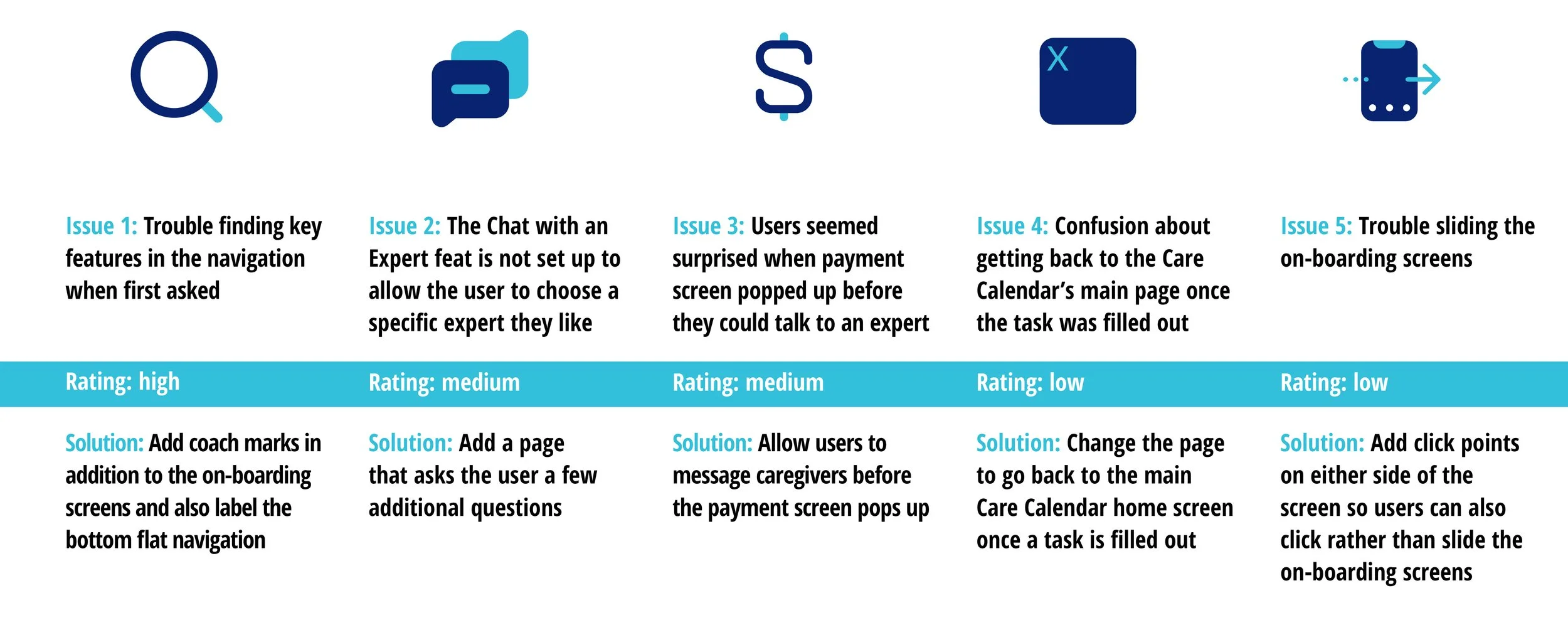
5 Key Issues
After evaluating all the data through affinity mapping, clustering ideas together, and creating the rainbow spreadsheet, I identified my top high priority issue was users having trouble finding key features in the navigation when I first asked, I rated it as high because all 6 participates experienced some form of trouble navigating and it’s a major issue if users can’t find what they are looking for.
Fixing Issues
Issue 1:
To fix the issue of trouble finding key features in the navigation I decided first to label the bottom flat navigation with each name of the key task. I first came to this solution because adding the text to the bottom navigation is a simple step that could help users quickly and easily identify any question they had about the navigation icons. Adding that text communication left little confusion to the user about what that task could be. Through further testing I can identify if this improved the issue.
Another solution could be to add coach marks to help the users find the task faster once they first land in the application. This solution came to mind because I did see users struggle to find certain tasks when I first asked them, but often the users ended up finding what I had asked for with a little more looking around or further clarification.
Issue 2:
Another key issue was that users asked if they would be able to choose their expert when using the Chat with an Expert feature because as they pointed out, not all experts are the same and some may have more experience in dealing with personal care or help answering questions about Alzheimer disease.
Issue 3:
Another issue I was able to identify was that some users had issues sliding the on-boarding screens, my suggested change was to add click points on either side of the screen so users can either click or slide.
To test this last one further, I wanted to identify if users may prefer a slide screen, click screen or both, so I created a preference test.
Preference Testing
Preference tests are a good follow up method to a usability test to re-test a possible solution to an identified issue
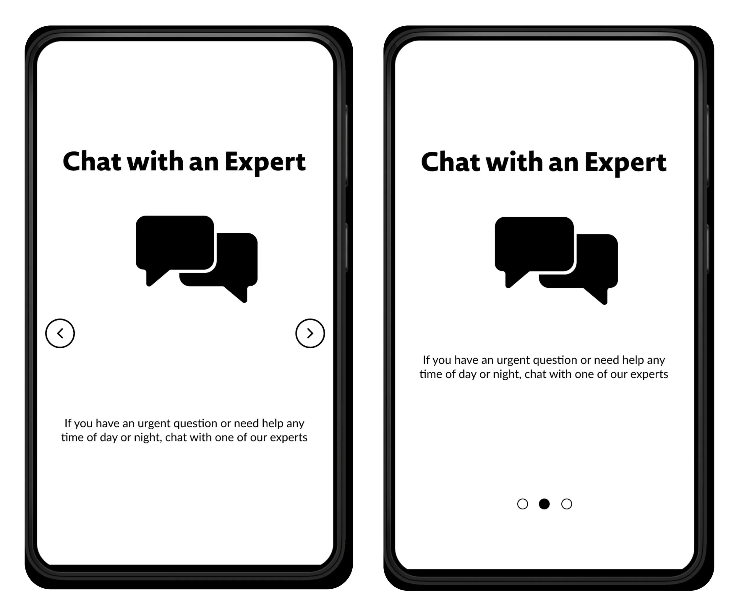
On-boarding Screens
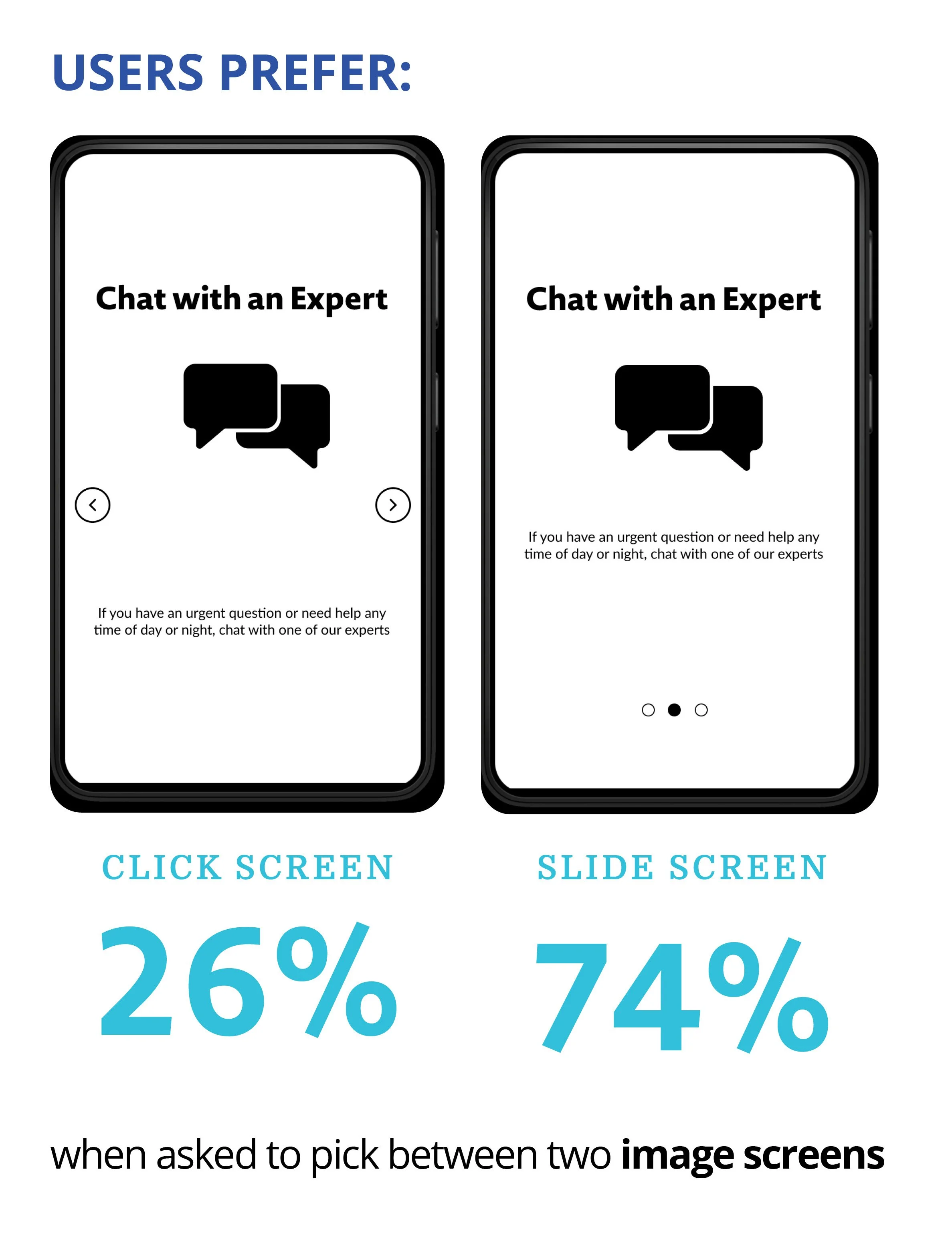
During my usability testing I discovered that some users were having issues with swiping the on-boarding screens. To test this further, I created a preference test to see if users would prefer the ability to click through the on-boarding screens, swipe or have the ability to do both.
The Results are in:
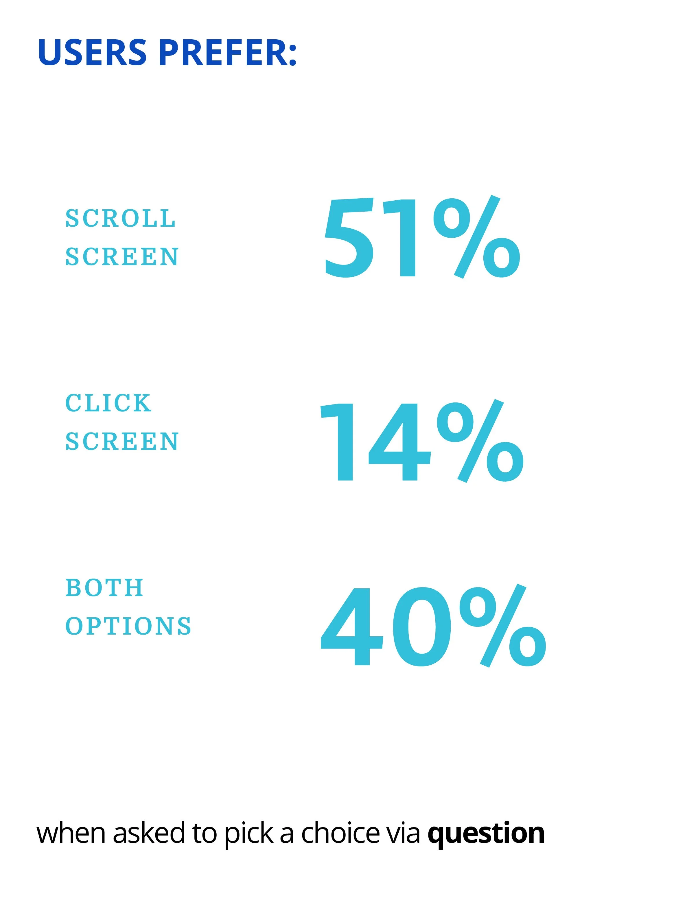
By running a preference test I was able to determine that users preferred the slide on-board screens with 74% choosing this method and 26% choosing a click screen out of 43 participants.
When asked, “Would you rather be able to scroll to the next screen or click?” 51% stated they prefer to scroll, 14% stated they prefer to click and 40% stated they prefer both options.
Re-Design
Purpose: To continue to develop and redefine the best user experience
Enhance user experience through a system of design
Color + Typography + Iconography + Illustration
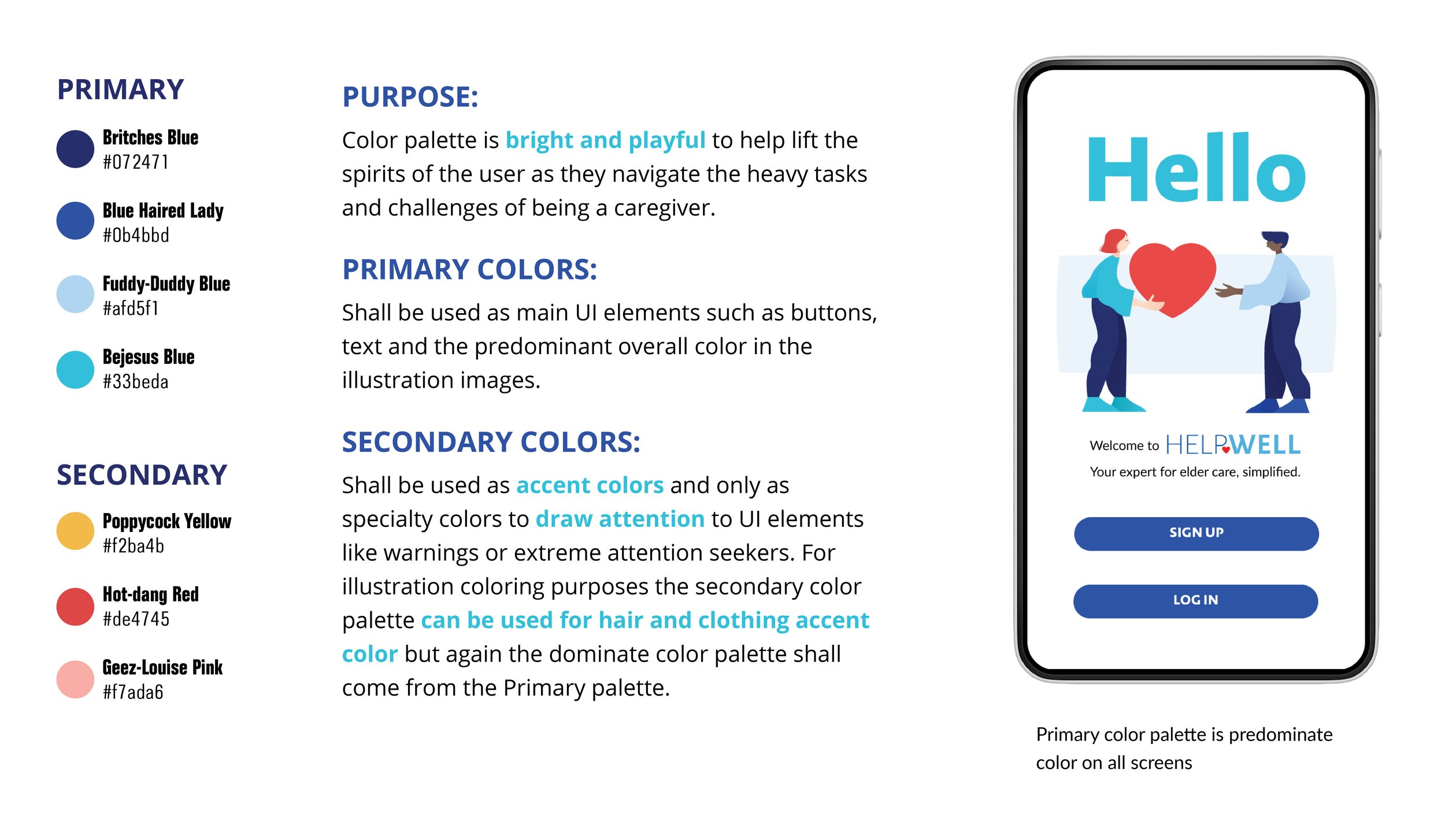
Color is very import, as it can set the mood and tone of the application. Since HelpWell is an app that helps the caregiver take care of a loved one when they can no longer care for themselves, I knew I wanted the color palette to reflect that medical aspect but with a calming tone. I choose blue hues as the main primary color palette to established that calming feel throughout with a secondary palette to ensure red and yellow could act as accent colors to add a touch of that medical aspect. I also wanted to add that iconic heart element throughout, since a lot of the caregiving process is someone caring from their heart for another human being I really wanted that to be embedded in the design.
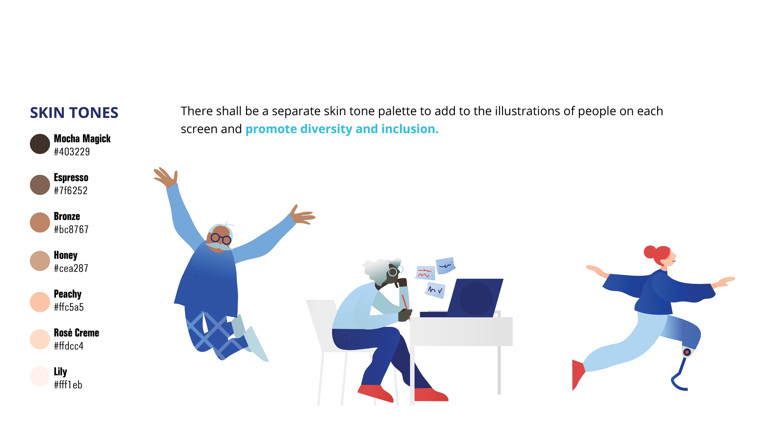
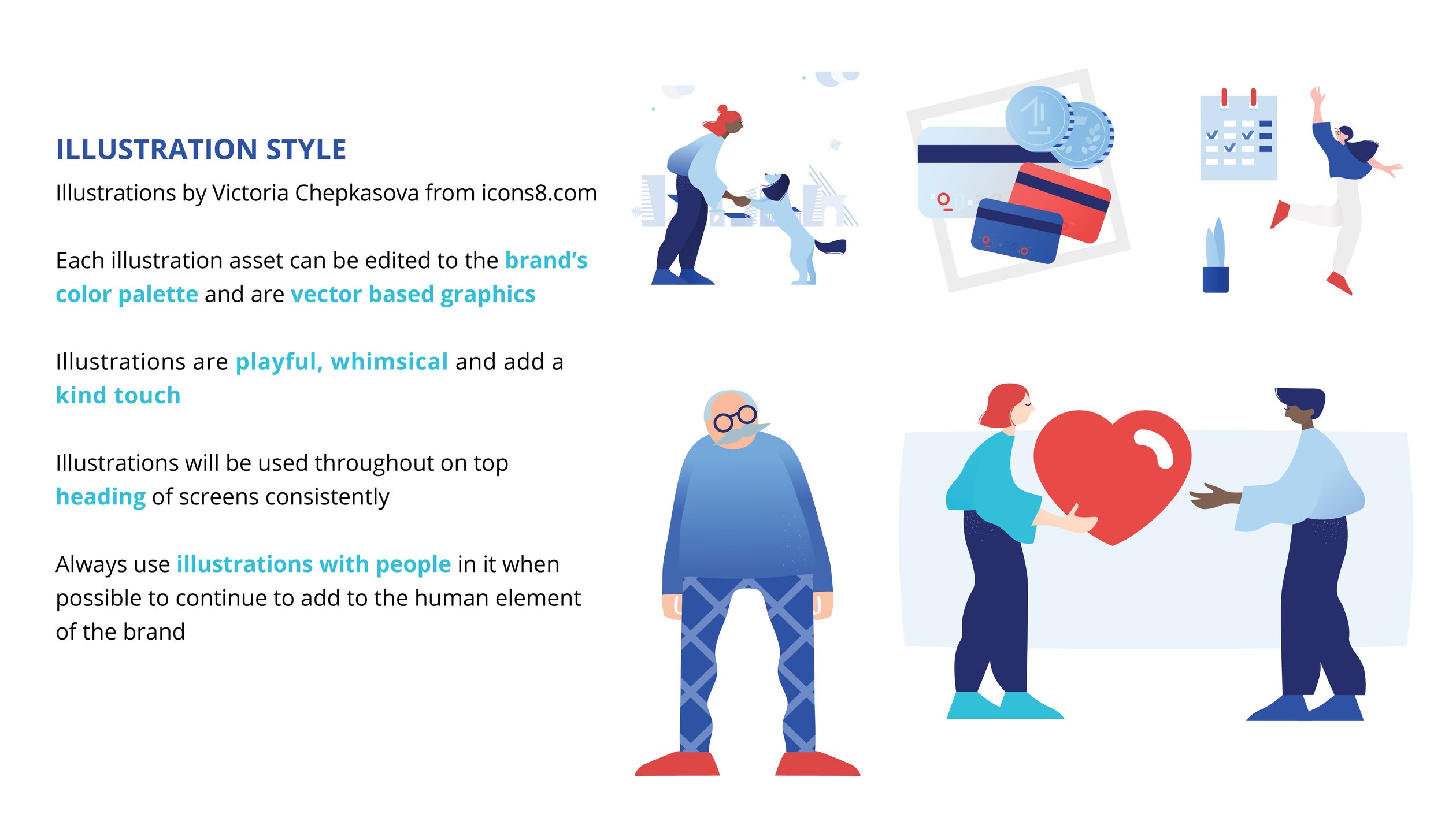
Another element I wanted to make certain of was the human element. Since this application is all about people taking care of one another, I knew I wanted illustrations of people throughout and I wanted to include a diverse cast. I created another separate color palette specifically for skins tones and I also tried to find illustrations that were inclusive.
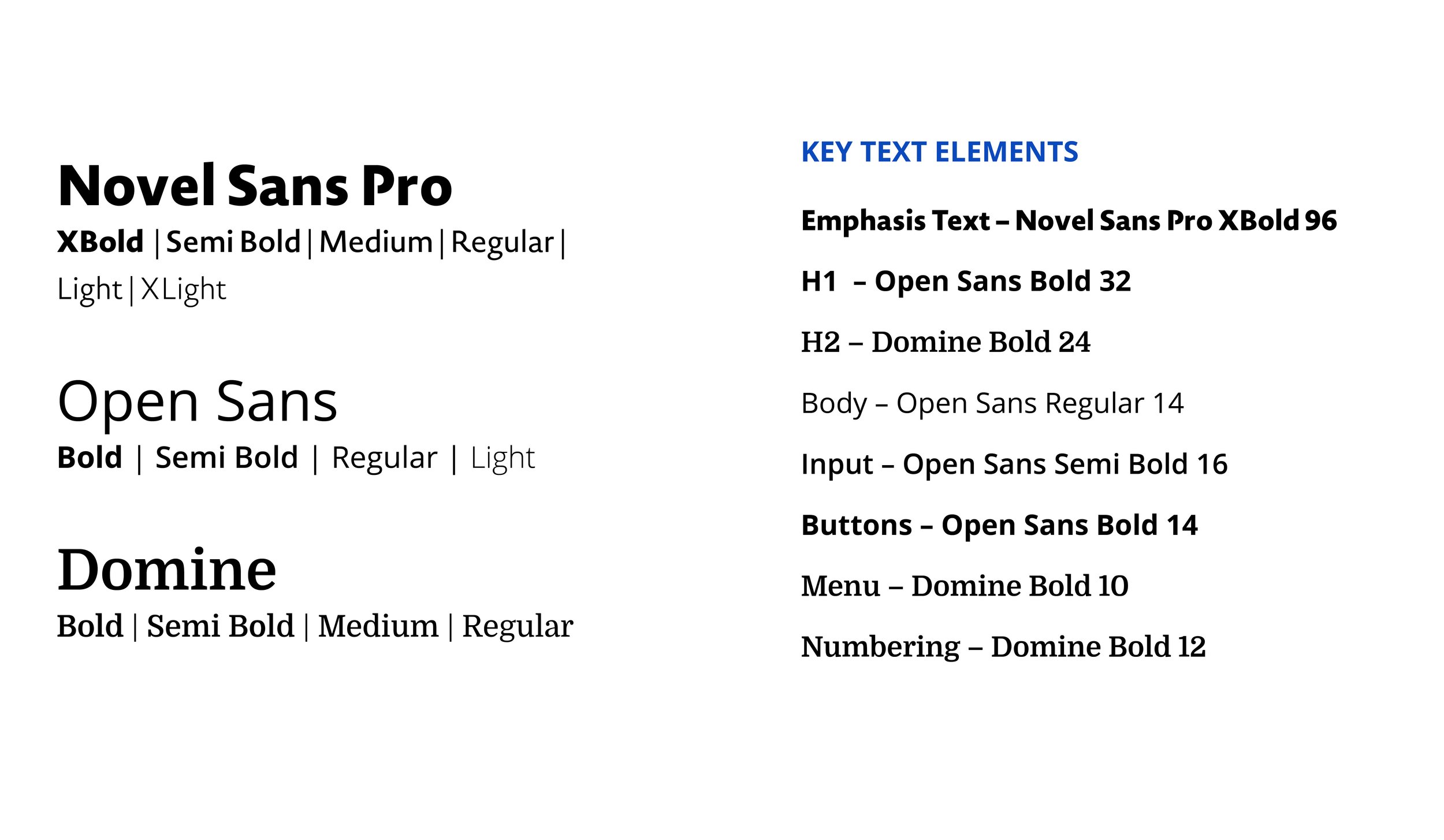
Typography is another big element that I wanted to reflect the human element of the application. I used Open Sans predominately for ease of legibility and with its big rounded geometric San Serif forms, it was optimized for mobile interfaces. It also has plenty of varying weights making designing the type easier. I paired it with Novel Sans Pro for a font that could add larger emphasis when needed and Domine which is a modern serifed font, that has a distinct look apart from Open Sans but it too was optimized for the web.
When looking for an icon set, I wanted to find a good one that has plenty of classic icons so users would easily be able to identify navigational elements. I also looked for a set that had rounded forms to again reflect the human element throughout. I also wanted to use this sets duo-tone version to add a bit of fun and color.
When coming up with the illustration style for the application I knew that I wanted there to be humans embedded throughout as a reflection of the apps purpose. But with such a heavy task that the user is taking on, being a caretaker – through user interviews I found out just how heavy of a task it is – caring for someone and that every user I interviewed stated it’s not something someone should do alone, you really need a team and support throughout the process. I thought adding an illustrative style that had a playfulness and whimsical tone could also help lift the spirits of the user as they carried out their planning and tasks amongst their care team.
UI Elements
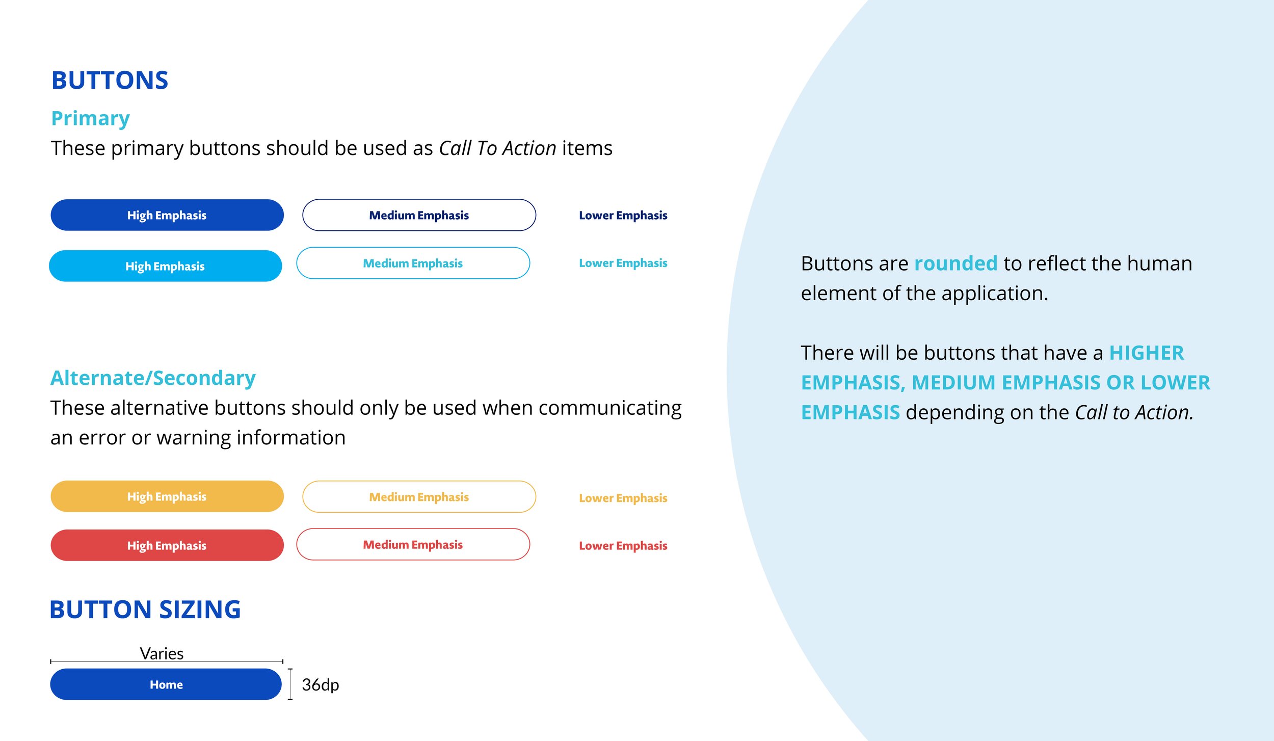
Designating structure for the buttons, again I wanted everything to be cohesive and rounded. And I knew there needed to be varying elements of emphasis for buttons in particular, so the highest emphasis is a solid color-filled button to attract the most attention, the second is a simple stroke outline around a white button with colored text and the third is simply the colored text. This leads the user to click on the most import call to actions where it is needed.
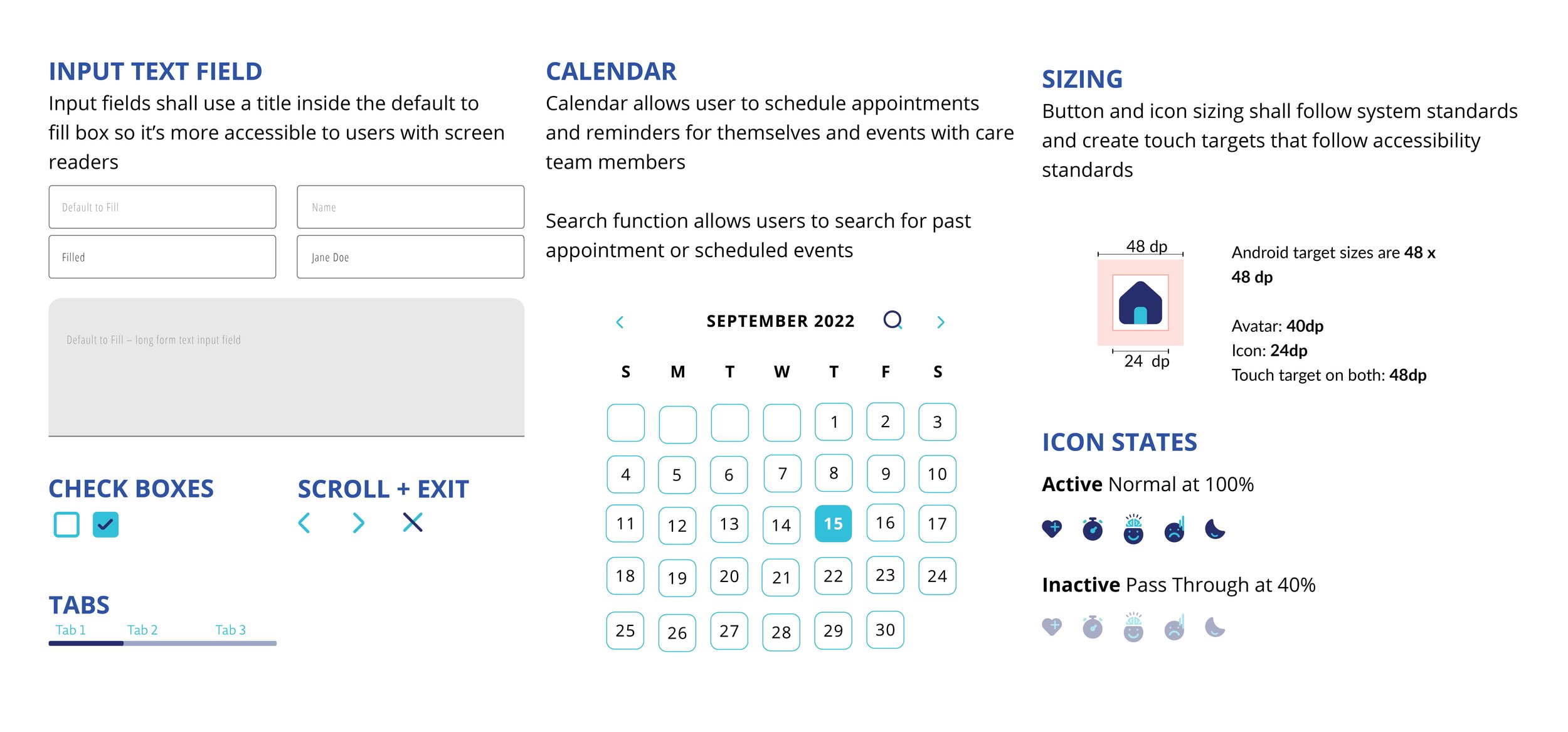
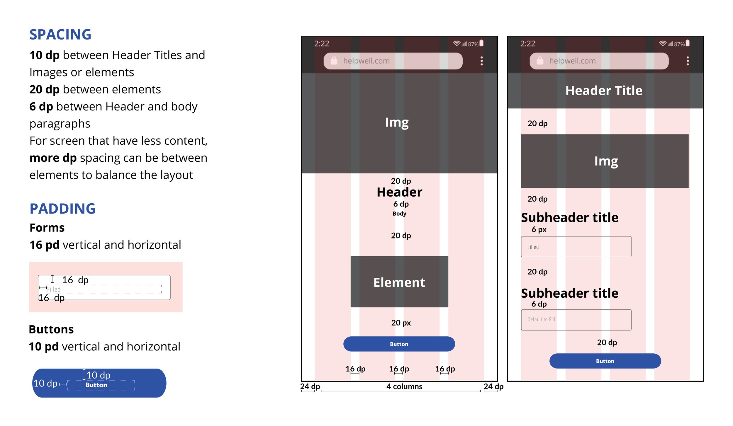
When creating input text fields, calendars and sizing of elements I looked to Material Design’s guide as to their structure. After learning about accessibility I was also able to better iterate upon this and add title about the input fields.
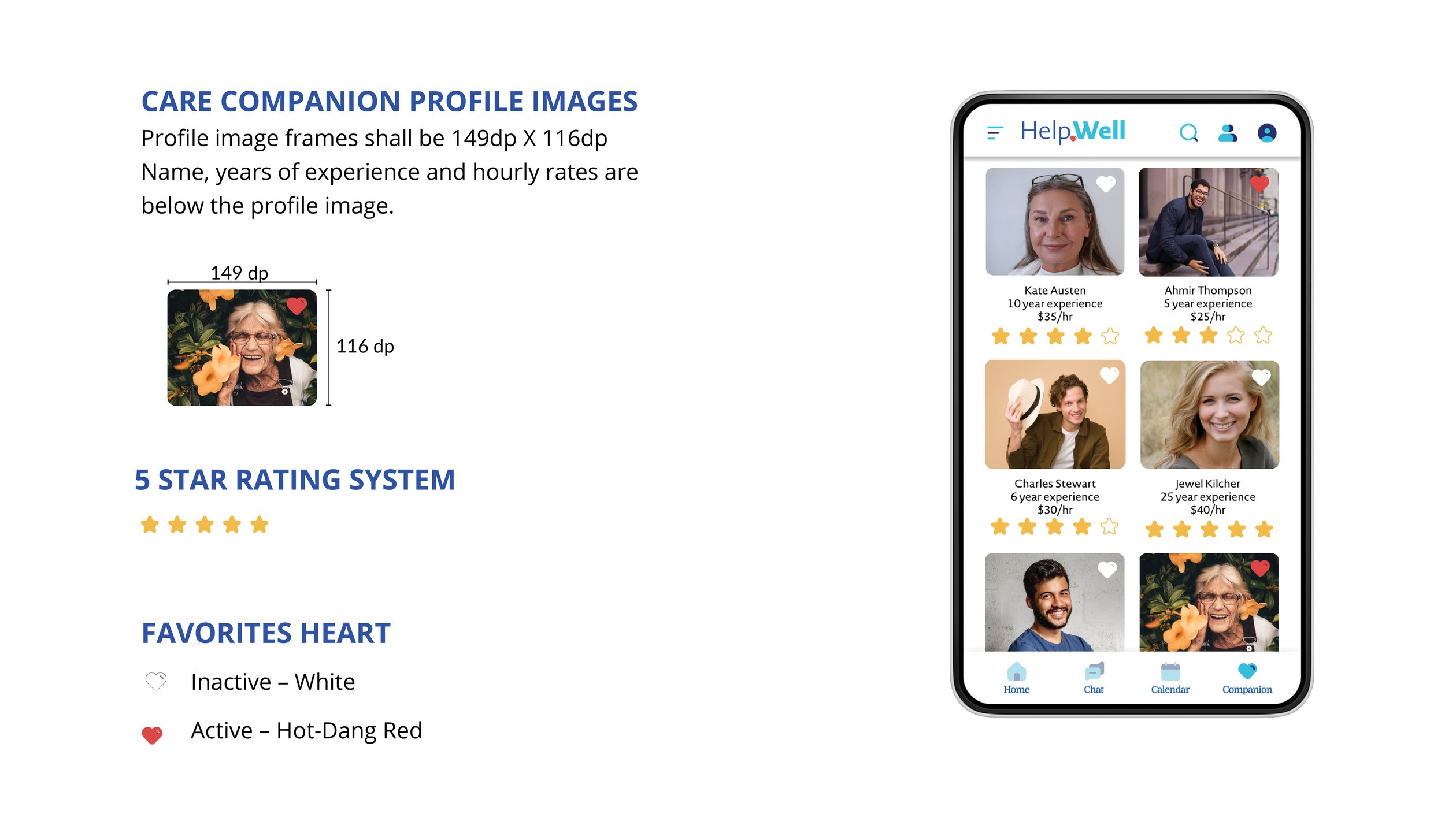
I also wanted to create a structured grid for the Care Companion section to allow the user to easily browser the page and see key items that could help them determine if they would like to click on a certain profile and get more information. I laid out sizing of the profile picture elements as well as an ability to favorite certain profiles so the user can come back to the ones they have marked with the “heart” element, turning red when activated.

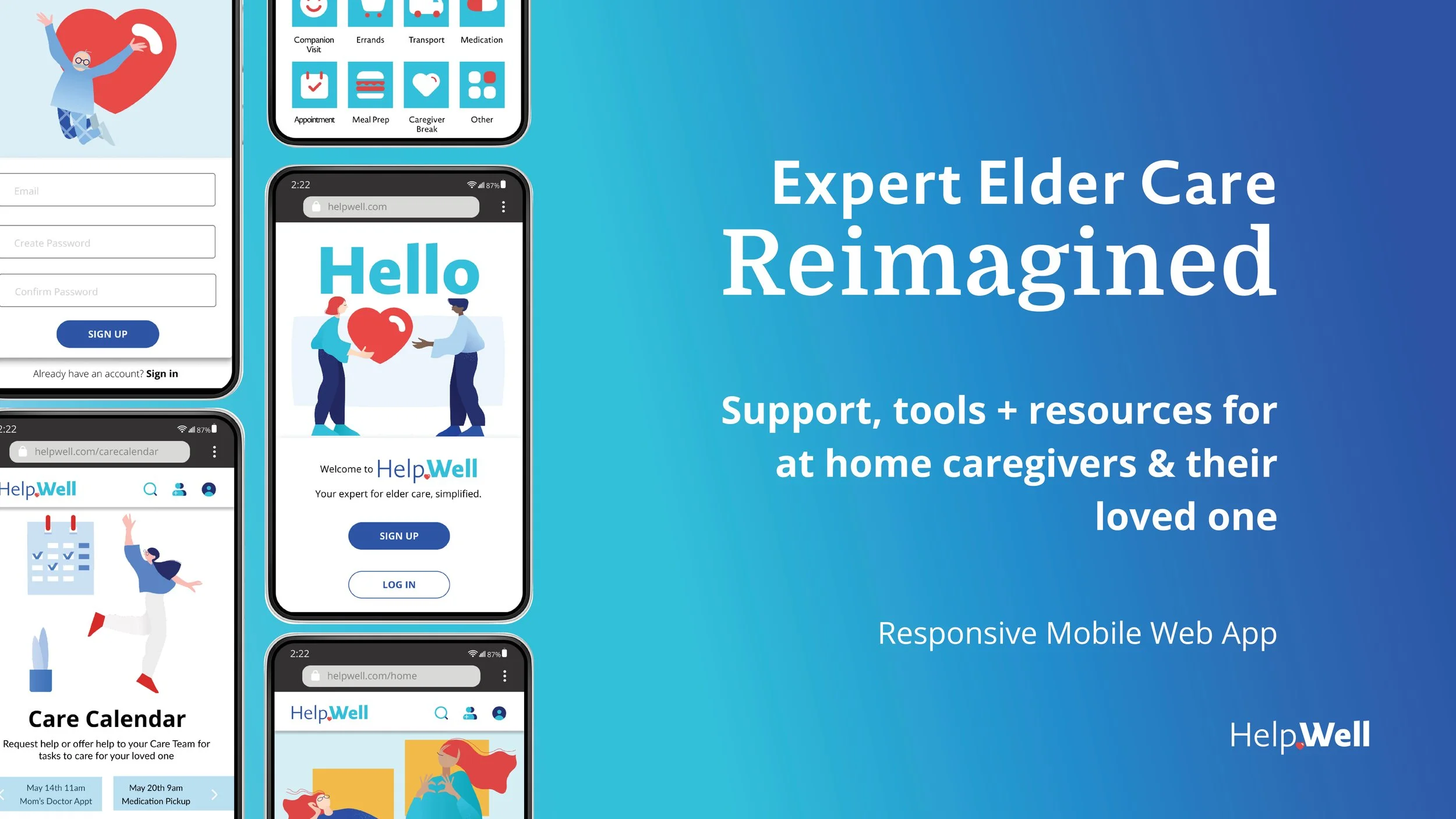
Polished Prototype
A design that allows the user to easily accomplish tasks in order to care for their loved one with the support of a care team, reminders and access to an expert, all in one easy to use application


Introducing
HelpWell
Expert Elder Care. Simplified.
Users can create a Care Team of family and friends to help aid in the care of a loved one when they can no longer care for themself. Add Care Tasks to their collective Care Calendars, get reminders and notifications. Chat with an Expert when questions arise. Hire a Care Companion when extra care is needed on the team. All in one, easy to use application, all designed with the user in mind.
Thank you for taking the time to view
To work together please contact at hello@kateoakley.com